As a tarot reader, colors can be a powerful tool to enhance the energy and symbolism of the cards. However, there are circumstances where you may want to avoid using colors in your readings. In this section, we explore the importance of colors in tarot readings and when it may be necessary to opt for colorless tarot readings.
Colors can be distracting and overwhelming, especially for individuals who are color-blind or when reading in low-light environments. Additionally, some readers may prefer a minimalist approach that focuses solely on the symbolism and intuitive interpretations of the cards. Whatever the reason, there are alternative options available that can still convey powerful messages without the use of color.
Key Takeaways:
- Avoiding colors in tarot readings can be beneficial in certain circumstances.
- Colorless tarot readings can provide a minimalist approach that enhances the focus on symbolism and intuitive interpretations.
- Alternative options such as monochromatic designs or grayscale can still convey powerful messages without the use of color.
Understanding the Impact of Colors in Tarot Symbolism
Colors play a significant role in tarot symbolism. Each color carries its own energy and meaning, allowing for a deeper interpretation of the cards. For instance, the color red in tarot represents passion, intensity, and action, whereas blue represents wisdom, clarity, and communication.
When conducting tarot readings, it’s essential to understand the impact of colors and how they enhance the energy of the cards. However, there may be times when you want to remove colors from your readings.
Tarot symbolism without colors allows for a more minimalist approach to readings. By removing colors, the focus shifts to the card’s symbolism and intuitive interpretations, leading to an increased connection with the cards.
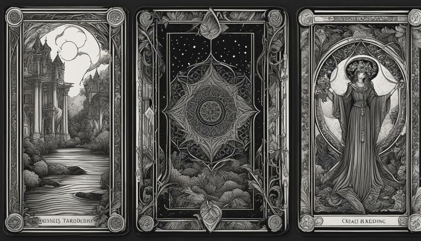
Tarot readings in grayscale also provide a unique experience. Without the distraction of color, the reader can delve deeper into the symbolism and meanings of the cards. This approach allows for a more introspective and contemplative reading.

Removing colors from tarot readings can create a powerful impact on the reader and the querent. It allows for a more focused and intentional approach, leading to a deeper understanding of the cards’ messages and insights.
When to avoid using colors in tarot readings
As tarot readers, it’s essential to consider situations where the use of colors could potentially distract or hinder the intuitive connection with your clients. In such cases, avoiding colors altogether could be a viable option to optimize readings for clarity, depth, and focus.
One scenario where it may be appropriate to avoid colors is when conducting tarot readings for individuals who are color-blind. In such cases, the use of black and white tarot cards or a deck with no colors may provide a more inclusive and accessible reading experience.
Another situation where avoiding colors may be necessary is when reading in low-light environments, such as dimly lit rooms or outdoor spaces at night. In these cases, colors may be difficult to distinguish, making it challenging to interpret the cards accurately. A monochromatic tarot design or grayscale readings without colors may provide a suitable alternative to enhance intuitive connection and avoid misinterpretation.

Finally, some individuals may prefer a minimalist approach to tarot readings, where the focus is entirely on the symbolism and intuitive interpretations. In these cases, a deck with no colors or black and white tarot cards may provide a unique and impactful reading experience.
By considering the limitations and preferences of your clients, you can make informed decisions about when to avoid using colors in your tarot readings. Black and white tarot cards, colorless tarot decks, or grayscale readings can provide an inclusive, accessible, and minimalist approach to enhance intuitive connection and provide accurate insights and messages.
Exploring alternative approaches to color
When it comes to tarot readings, color is not always necessary to convey powerful messages. In fact, minimalist tarot designs that use a limited color palette can be just as effective in facilitating intuitive connections. By simplifying the visual elements, the focus can shift towards the symbolism and interpretations.
A grayscale tarot reading can also offer a unique and impactful experience. By removing colors from tarot cards, the depth and complexity of the imagery are amplified. The absence of color allows us to explore the nuances of the cards in a different light. As a result, many readers have chosen to incorporate grayscale tarot readings into their practice.

Minimalistic and grayscale approaches to tarot allow us to tap into our intuition without being distracted by colors. We can focus solely on the energy and symbolism of the cards, allowing for a deeper understanding of their messages. When it comes to tarot, it’s important to remember that the goal is not to impress with vibrant colors but to connect with our intuition and receive guidance from the cards.
Conclusion
In conclusion, we have explored the importance of colors in tarot readings and the circumstances in which it may be necessary to avoid using colors. By opting for colorless tarot readings or alternative approaches such as monochromatic designs, you can optimize your readings for clarity and intuitive connection, ensuring that colors do not distract from the insights and messages the tarot has to offer.
It’s important to keep in mind that while colors can add depth and nuance to tarot readings, they are not essential for a successful reading. Whether you opt for a minimalistic tarot design or a grayscale reading, the symbolism and interpretations of the cards can still be powerful and impactful.
So, the next time you conduct a tarot reading, consider whether or not the use of colors enhances or detracts from your insights. Ultimately, the goal is to provide your clients with the most accurate and intuitive reading possible, and sometimes, that may mean embracing a colorless approach.
Thank you for joining us in this exploration of tarot readings without colors. We hope that this information has been helpful and informative to you.
FAQ
Q: When should you avoid using certain colors in your tarot readings?
A: Colors should be avoided in tarot readings in situations such as readings for individuals who are color-blind, readings conducted in low-light environments, or when seeking a minimalist approach. Alternative options such as colorless tarot readings and monochromatic tarot designs can be used to optimize clarity and intuitive connection.
Q: What is the impact of colors in tarot symbolism?
A: Colors play a significant role in enhancing the energy and meaning of tarot cards and their interpretations. However, it is possible to remove colors from tarot readings and still convey powerful messages. Tarot readings in grayscale or with colors removed can provide a unique and impactful reading experience.
Q: How can I explore alternative approaches to color in tarot readings?
A: Alternative approaches to color in tarot readings include minimalistic tarot designs that use a limited color palette to focus on symbolism and intuitive interpretations. Additionally, tarot readings in grayscale allow for a different level of depth and exploration by removing color distractions.
Q: What is the significance of black and white tarot cards?
A: Black and white tarot cards provide a unique and impactful reading experience. They offer a minimalist approach that allows the focus to be on the symbolism and intuitive interpretations, without the distraction of color. This can enhance clarity and connection in tarot readings.